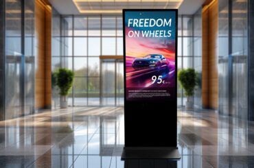
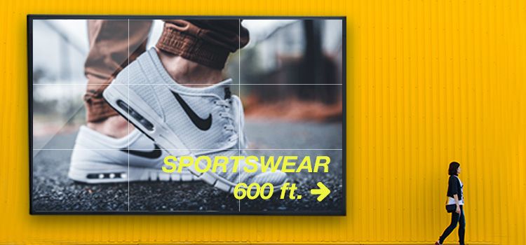
Digital Signage means showing advertising content on digital devices like screens or mobile displays. As to visual communication by digital signage solutions, there are many things to take into consideration. It’s very important to have a personal advertising message interacting with the audience in the right way. It all depends on
- a good, media suitable concept
- the right amount of content
- a reasonable communication strategy
For having a coherent concept at the end and an advertising message that catches the audience, it’s not only important to have a good text but also a good design. For this reason, some important typography rules are the essential things. Only when typography is being used correctly an interactive media interface can provide additional benefit for the audience.
Elements for good readability on digital signage screens
To make content design and furthermore the typography of the advertising text on digital signage screens readable and have them achieve the advertising goals, several elements need to be well coordinated:
- display size
- resolution
- reading distance
- viewing angle
- font size
- brightness contrast and
- surrounding
They are immediately related to providing a well readable presentation.
How to design content typography effectively
Whilst waiting people tend to pay more attention to reading displays. However, if they are faced with it too often on a daily base at train stations, the subway or in a bus they are becoming inured to visual effects by the time.
Relevant content with a good choice of typography on a digital sign combined with diversified design can counteract that. As there is only a limited period of time and attention of about three to six seconds available for the customer to be reached by digital signage, there shouldn’t be too much content on the display at once.
Better: focus on the statement and express it by the slogan “less is more”. Especially at running texts readers don’t have the possibility to skip their view backward in that short amount of time. That’s why text passages should be held as short as possible here – double the size of what the screen can display at once should be the maximum for advertising texts.
The shorter an advertising text is, the better it can be noticed and handled by the audience. It’s better to put longer advertising texts in several lines in which one line shouldn’t contain more than 55 to 85 characters. Too much content without visual room is not communicative in an appropriate way.
Digital Signage design – Put longer advertising texts in several lines in which one line shouldn’t contain more than 55 to 85 characters.
The special font for the digital signage design?
Basically, headlines and running text can be different in
- size
- colour or
- style
Layout and structure are more important for a pointed and activity-oriented perception. Nevertheless, a good font for an electronic medium should be striking. As modern displays have higher resolutions more and more nowadays any font can be used for the digital signage sector.
The best way would be to concentrate on two to three different styles. That means that the text body should be written just in one font and size, though. But you can be a little more adventurous using different fonts. However be careful with two very similar fonts as this may seem to be faulty and used by mistake. The most used fonts for advertising messages are
- Arial (28 %)
- Helvetica (20 %) and
- Verdana (8 %).
If a special font is required this one can be modified for a screen through little changes such as size or enlarging the character distance.
Consider reading distance and font size
Reading distance is playing a big part when thinking about typography for digital signage as the consumer is standing in front of the display at a distance of 1,5 to 3 meters. Therefore fonts have to be used in a size big enough to provide a comfortable reading. The text should be in good contrast to the background of the display to avoid overloading the reader’s eyes. The higher the distance between screen and reader the bigger the font size should be:
Font size in points
20 pt.
34 pt.
50 pt.
66 pt.
100 pt.
133 pt.
Reading distance in meters
ca. 2,00 m
ca. 3,50 m
ca. 5,50 m
ca. 7,50 m
ca 10,00 m
ca. 15,50 m


